Flow
Just some notes to self about representing flow over maps for the AHRC Connected Community project ‘The Memories of Mr Seel’s Garden‘. The project is a collaboration between Transition Liverpool, Friends of Everton Park and the Friends of Sudley Estate, as well as academics from Liverpool, Manchester, Glasgow and Edinburgh. The main aim of the project is to explore how engaging local communities with the changing patterns of urban food production might contribute to current grassroots efforts within Liverpool to raise awareness around current food issues.
Links provided with the help of Peter Pratt at the University of Edinburgh.
German Trains
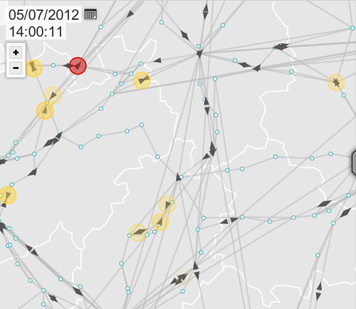
This is a live visualisation of trains across Germany – its very cool if you zoom in
http://zugmonitor.sueddeutsche.de/
and a news article on the work:
http://infosthetics.com/archives/2012/03/monitoring_the_delays_of_trains_in_real-time_in_germany.html
 The people behind OpenDataCity [opendatacity.de] released a real-time map of delayed long-distance trains [sueddeutsche.de] of the Deutsche Bahn, as they happen to drive around in Germany.
Trains are represented as arrows, of which the overlaying colored circle denotes an estimation of the actual delay. The map can be explored in a “live- mode”, revealing all current delayed trains, or in an “historic mode”, for instance by dragging (or selecting within) the timeline at the top. A Play-button then highlights the relative movement of the trains as they are traveling, or traveled so far, through Germany. In addition, each train on the map can be selected to display more detailed information (such as the official reasons for the delay, for example).
A separate query interface allows discovering the most delayed trains in a certain period of time, by train station, or by the train number. Resulting trains can then be selected from the result list to be highlighted on the map.
Cognitive Maps

This is a very interesting use of software to allow people to remap a Cartesian base map according to somebody’s cognitive perception of a place.
http://www.looksgood.de/log/2011/10/mapmap-vauxhall-mashup-mental-maps-and-openstreetmap/
“I always was fascinated by mental maps, the idea to ask a person to draw a map from memory, to get an insight of the person’s perception of the world. In my ongoing Design Interactions master we were invited to do a community related project with the local residents of Vauxhall (inner city area of South London), so finally I had a chance to engage myself in this concept.
Furthermore, I was wondering whether it is possible to go with the mental map concept one step further. My idea was not only to collect mental maps of Vauxhall, but also to combine these mental maps with real world map data to “interpolate”, or in a way, to fill the white spots of the mental maps with data of the realities. I was hoping to gain with these mashup maps new insights in terms how people “see” Vauxhall e.g.: how is the space order around them? are there things they would like to change? what is important for them? etc.” Benedikt Groß
Edinburgh Cresta Run
 http://thecrestarun.com/speedFiles/take3.html
which is part of…
http://www.alistapart.com/articles/svg-with-a-little-help-from-raphael/
Demonstrates the simplicity of drawing flow over maps – this works really well on smart phones making it very accessible as a technical approach even though it doesn’t look so cool!
Wind map
 This is simply wonderful – the flow of Wind across the US:
From the developer:
“The wind map is a personal art project, not associated with any company. We’ve done our best to make this as accurate as possible, but can’t make any guarantees about the correctness of the data or our software…Surface wind data comes from the National Digital Forecast Database. These are near-term forecasts, revised once per hour. So what you’re seeing is a living portrait. (See the NDFD site for precise details; our timestamp shows time of download.) And for those of you chasing top wind speed, note that maximum speed may occur over lakes or just offshore.” Hint.FM
Flowing Ships
http://sappingattention.blogspot.co.uk/2012/04/visualizing-ocean-shipping.html
These are beautiful illustrations of the flow of ships around the world. The first one is long: it shows about 100 years of ship paths in the seas, as recorded in hundreds of ship’s log books, by hand, one or several times a day.
The second has to do with seasonality: it compresses all those years onto a single span of January-December, to reveal seasonal patterns.
Related posts

Digital Human BBC Radio 4
Quick post on the BBC Radio 4 Digital Human programme produced by Peter McManus and presented by Al

Digital Sentinel funded by Carnegie UK Trust ‘Neighbourhood News’
Great to see that the work funded through the AHRC Connected Communities project Community Hacking h

I Am A Monument
I AM A MONUMENT by Aron Vinegar. MIT Press, Cambridge MA. 209 pp., illlus. Trade $29.95. ISBN: 978-0

Migratory Settings Book
Review by me for Leonardo Reviews interesting book – slow to get through, but worth it. Migrat

